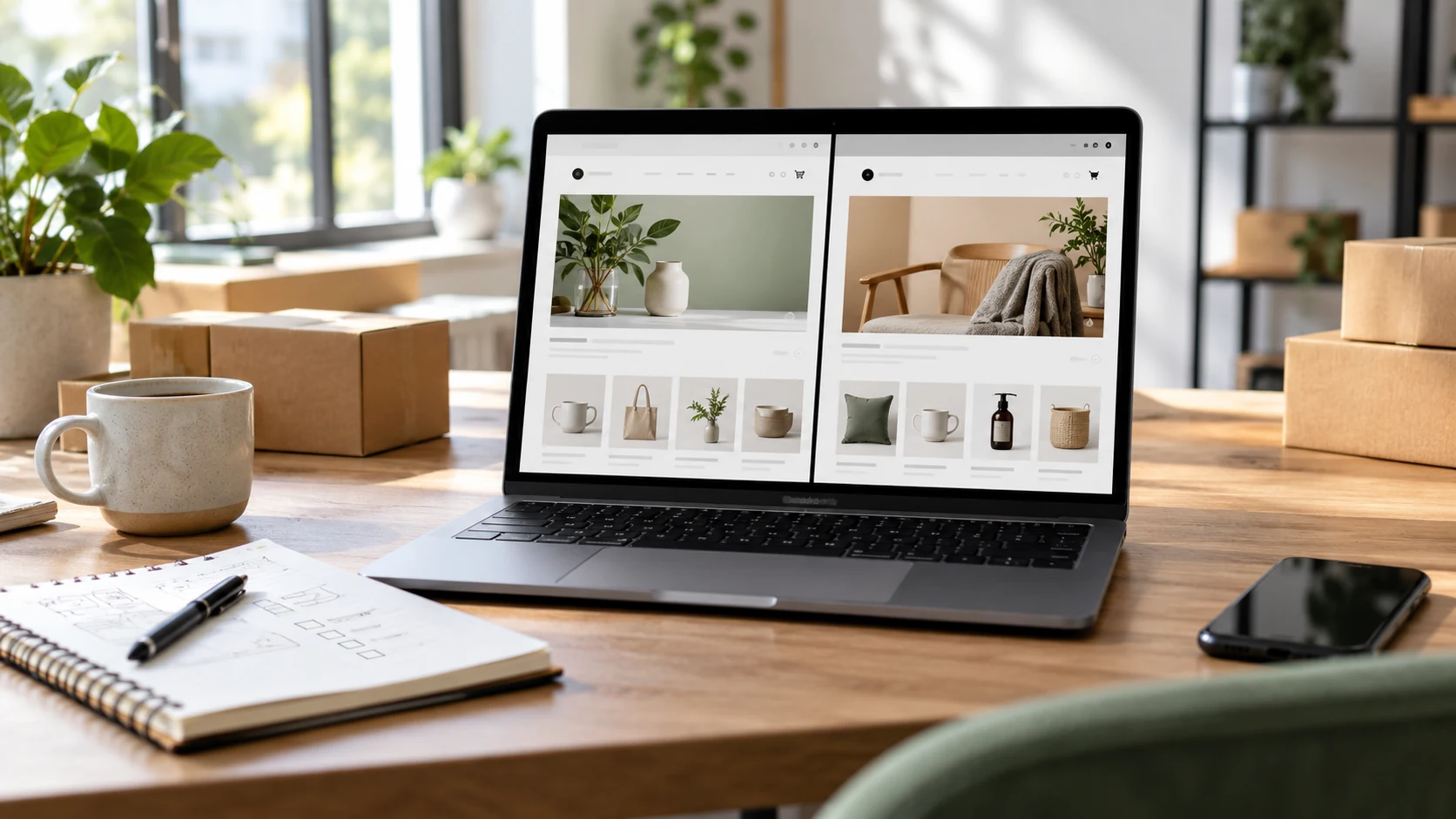
Many stores lose customers because the buying path feels uncertain. The design may look fine, but the customer cannot quickly understand the product, trust the store, or complete the order without friction.
1. Product Pages That Do Not Answer Buyer Questions
- Weak product titles.
- Missing size, material, warranty, or delivery details.
- Images that look attractive but do not show enough practical detail.
- No clear next action near the product information.
2. Mobile Layouts That Feel Like a Shrunk Desktop
Most customers browse and compare from mobile. Buttons should be easy to tap, filters should not hide key products, and long product content should be organized into readable sections instead of becoming a wall of text.
3. Checkout That Creates Doubt
- Unexpected costs appear late.
- Delivery timing is vague.
- The customer cannot easily edit cart details.
- Trust signals are missing near the final step.
Ready for the next step?