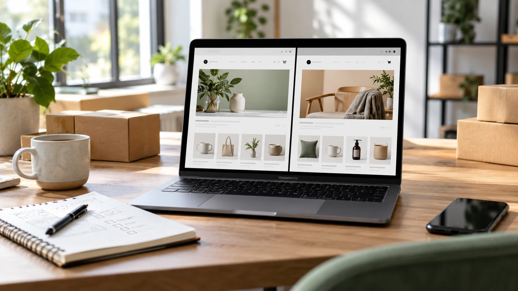
A product page has to do the work of a salesperson without forcing the customer to ask basic questions. It should help a visitor understand the product, judge whether it fits, know the full cost and delivery expectation, and feel confident enough to continue. Attractive visuals matter, but clarity is what moves the customer toward the cart.
Start with a Complete Buying Summary
The first product screen should answer the fastest purchase questions: what the item is, its price, current availability, important options, the primary benefit, and the next action. Do not place essential conditions inside distant tabs. If size, compatibility, minimum order, subscription terms, or customization changes the decision, show that information close to the product title and action area.
Use Images to Remove Uncertainty
- Show the complete product from useful angles, not several nearly identical photos.
- Include close details for material, finish, controls, labels, or craftsmanship.
- Provide scale through dimensions, a person, or a familiar object when size is not obvious.
- Use consistent lighting and backgrounds across the catalog.
- Add video only when movement, setup, or use is easier to understand visually.
Write for Decisions, Not for Word Count
Begin with a concise explanation of who the product is for and the problem it solves. Then organize specifications, materials, care instructions, dimensions, included items, compatibility, warranty, and usage notes under descriptive headings. Translate technical features into practical meaning. Instead of only saying that a battery is 5,000 mAh, explain the expected use case without promising results you cannot verify.
Make Price, Delivery, and Returns Predictable
Unexpected costs are a common reason for abandonment. Show whether tax is included, when shipping is calculated, typical delivery ranges, available locations, and any cash-on-delivery conditions. Link the return policy near the decision area in plain language. For made-to-order or personalized products, explain production time and which changes make an order non-returnable before the customer pays.
Design Variants and Mobile Actions Carefully
Variant selectors should use familiar labels and make unavailable combinations obvious. Update price, image, stock, and SKU consistently after a selection. On mobile, keep the page readable, make tap targets comfortable, and ensure the purchase button appears after enough information to make sense. A sticky action can help on long pages, but it should not cover content or hide the selected option and price.
Ready for the next step?